Responsive Layout
how Happycoders Private Limited good in Responsive:
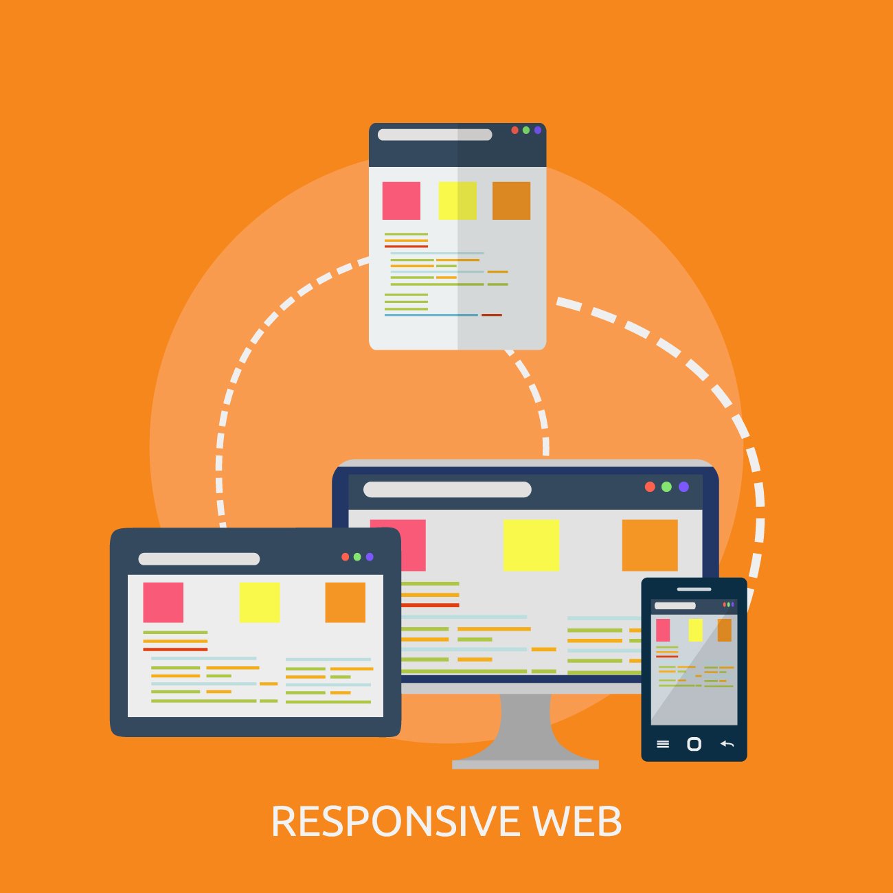
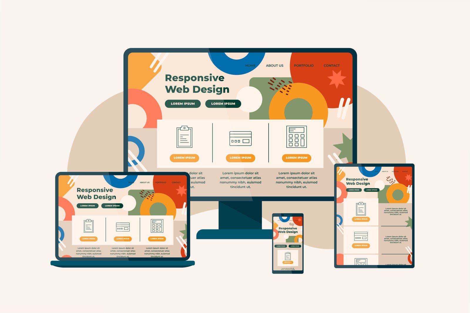
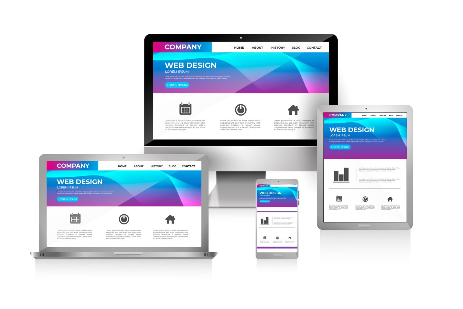
Long story short, If your website is not responsive, you have to chance to survive among your competitors. To know what our developers are capable of and how a responsive layout can affect your website, let’s take Happycoders Private Limited’ website and the page you are browsing right now as an example. If you are on a tablet, you notice it fits nicely there, a cell phone also the same and a desktop computer as well. If you are on a desktop you can see responsive design in action by grabbing your browser window and making it bigger and smaller. You will see that the website responds by adjusting the text and visual items on the screen to make viewing the page easier.
key principles of Happycoders Private Limited
- Flexible Layouts: Use fluid grids that allow elements to resize proportionally, rather than using fixed-width layouts.
- Media Queries: CSS3 media queries allow the application of different styles based on device characteristics such as screen size, resolution and orientation.
- Flexible Images and Media: Images and media should scale to fit within their containing elements. Use CSS techniques like
max-width: 100%to ensure images resize within their containers. - Responsive Typography: Adjust font sizes and line heights to improve readability on different devices. Techniques include using relative units like
emorreminstead of fixed units likepx. - Mobile-First Design: Start designing for the smallest screen size and then progressively enhance the design for larger screens.
- Touch-Friendly Interfaces: Ensure that buttons and interactive elements are large enough to be easily tapped on touchscreens.


Benefits of Responsive
- Improved User Experience
- Increased Mobile Traffic
- Cost Efficiency
- Improved SEO
- Easier Maintenance


